People usually hate certain fonts because they are overused, used in the wrong way and poorly designed. While some fonts are known for being stylish and easy to read, others are disliked for looking outdated or confusing. In this blog, we’ll explore the most hated fonts and the reasons behind their bad reputation.
1: Comic Sans
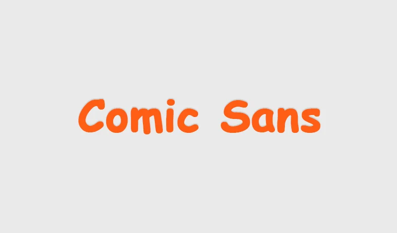
Comic Sans was first designed in 1994 by Vincent Connare to add a playful and cartoon-like touch to casual design. It is recommended for use in schools. It’s no surprise this font made the list, it’s often mentioned as one of the worst fonts because it lacks sophistication and is used in places where a serious tone is needed.
Why Developers Avoid This Font
Many designers considered it immature, overused and lacking professionalism. Its rough, informal look feels unfinished and often suffers from spacing and alignment flaws.
2: Arial
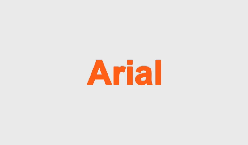
Ariel was used as the default font in Microsoft programs, which led many beginners and less experienced designers to rely on it frequently. This font’s simplicity and lack of personality are often seen as a drawback. It became disliked because Microsoft designed it to resemble Helvetica, allowing them to avoid paying royalty fees.
Why Designers Avoid This Font
Designers avoid it because it’s seen as a cheap copy of Helvetica font. It lacks originality and personality, making it a worst choice for professional designs. It is also considered the most hated font of low quality and criticized for being hard to read at a smaller size.
3: Time New Romans

Another Microsoft default font, it has appeared countless times in school papers, resume and documents. Time New Roman is not bad, it is iconic but it is strongly linked to academic and formal papers, a connection deeply rooted in the reader’s mind.
Why Designers Avoid This Font
They avoid it because it looks outdated and traditional. Its strong association with professional and academic settings makes it a poor choice (bad fonts) for creative work.
4: Papyrus
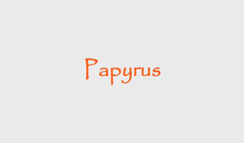
Papyrus type font has been criticized for trying to look old and ancient, as it bends Roman letterforms with calligraphy style . It was popular in the 90s, but now it is seen as the worst font for designers looking for an exotic look without much effort.
Why Designers Avoid This Font
Designers hate this font because it’s overused in health and natural products, often seen as culturally insensitive. Its uneven spacing and outdated look also make it a terrible font for professionals.
5: Bradley Hand
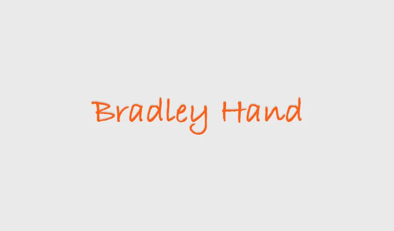
Created in the early 1900s, it can look old-fashioned when used for today’s modern web design and innovative interfaces. It is perfect for personal projects like invitations, greeting cards or scrapbooks.
Why Designers Avoid This Font
They avoid this font because it is outdated for modern projects, old-fashioned and overused in casual settings, which makes it look less professional and less unique.
6: Brush Script
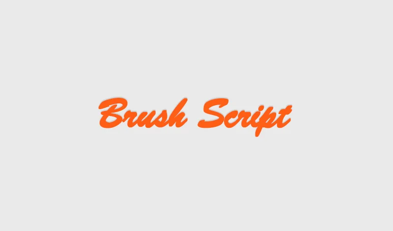
The brush script looks like casual handwriting, but it can be hard to read. Its heavy lines make it too bold and busy. It has been overused for years, especially on greeting cards and restaurant signs.
Why Designers Avoid This Font
Designers avoid Brush Script because it is hard to read and looks messy. It has been used too much in cards and signs, so it feels old and not professional.
7: Impact

Although named Impact, this font often disappoints designers. Its bold, heavy style is seen everywhere in internet memes, giving it an unoriginal look. It was created to grab attention on posters and headlines but its strong appearance can sometimes seem harsh.
Why Designers Avoid This Font
Many designers avoid this because it is outdated and too aggressive. Its content used in informal online content makes it hard to take seriously in professional designs.
8: Courier
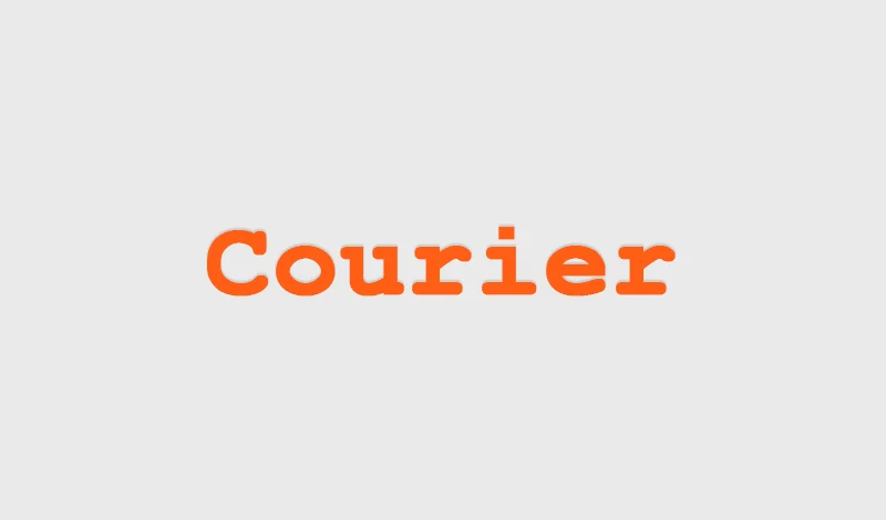
It initiated the style of the old typewriter but it is often viewed as dull and outdated. Its fixed width letter limits its use in modern design projects. Because of its typewriting style, it works well for coding, scripts and technical documents.
Why Designers Avoid This Font
They avoid this font because its fixed spacing can make text look less visually appealing. Its typewriting style also feels old-fashioned and limits creative design options.
9: Trajan
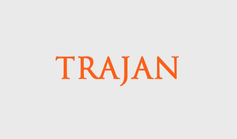
Trajan is a classic font seen in movie posters, from Titanic to Apollo 13. Despite its elegance, it’s been overused because it comes preloaded with Adobe Creative Suite, making it feel predictable.
Why Designers Avoid This Font
Designers avoid it because it is used in entertainment media. Its formal Roman style limits versatility and makes it hard to pair with modern fonts.
10: Hobo
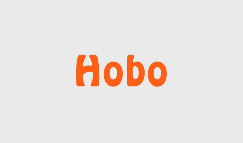
Hobo font is recognized by its rounded and curvy letters. The cartoonish shape and lack of straight lines make it vintage retro style. It is perfect for logos and branding but is hard to read in long texts.
Why Designers Avoid This Font
This font is hard to read in long text, which limits its use. Many professionals dislike its commercial use, such as in logos.
Conclusion
These fonts are the most hated fonts because they are overused, outdated, or hard to read. Designers prefer more versatile and modern typefaces that better suit today’s clean and professional styles. Choosing the right font is key to effective and appealing design. It’s always best to select fonts that improve clarity and fit the tone of your project.